If this is your first visit, be sure to
check out the FAQ by clicking the
link above. You may have to register
before you can post: click the register link above to proceed. To start viewing messages,
select the forum that you want to visit from the selection below.
I agree on the BBS 11 / HBA comparisons. I feel those black/white design trends that are common at the moment might fizzle out fairly soon.
Which means NILøS might not succeed. I'm not sure if there's much crossover between the Julius market and the people that would be inclined to buy NILøS.
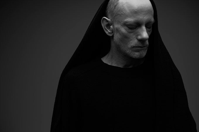
^ correct me if you know better, but it seems like there is one shirt with this type of print on it shown here? Ok so that one other shirt has some sort of a more abstract print in addition to what looks like a white block. I really wouldn't pigeonhole the whole concept or analyze it's potential success based on the above.
"AVANT GUARDE HIGHEST FASHION. NOW NOW this is it people, these are the brands no one fucking knows and people are like WTF. they do everything by hand in their freaking secret basement and shit."
^ correct me if you know better, but it seems like there is one shirt with this type of print on it shown here? Ok so that one other shirt has some sort of a more abstract print in addition to what looks like a white block. I really wouldn't pigeonhole the whole concept or analyze it's potential success based on the above.
(I don't know better). I think the comparisons are based on the NILOS tee, the blocked shirt/sweater, and the weird splattered flag. The second being sort of BBS11/HBA and the last sounding very much more HBA.
I think the bigger point is that the NIL shirt is the one that's being advertised so much. Most of the images feature that print, so I don't think it too strange to claim that that shirt is the "centerpiece" so to speak. If it was featured once, then maybe it'd be handwaved, but since there are so many images of it, at least here, we keep seeing the NIL print and it's the one that stands out so much, especially when Horikawa pretty much never openly advertised so much, beyond his manifesto on pants and the manifesto tee, which is arguably still somewhat abstract.
julius hasnt not had questionable printed tees in their collections for a while now. remember ss11 and that anarchy tee? i think this fits in line with the aesthetic universe tatsuro has created and is a masculine compliment to the increasingly femme, albeit unisex, MA line. it all seems very post apocalyptic neo-tokyo to me and thats spot on for my tastes. i think the comparison to hba is a bit of stretch outside of a black shirt with thick white letter and last time i checked it just has the print on the front respectively and not on both sleeves, the front, the back, the inside, and upside down. theres a difference between this and the billboard prints hba is doing. bbs11 is h&M for bbs, same designs at a fraction of the cost with lesser materials, an exercise in tech fabrics kiss my butt.
i am excited for this line and welcome it to a world of increasingly questionable collections from beloved designers. it's not a breath of fresh air but it's somethin'.
 Tweet
Tweet


Comment